Listening to Colour
What does strength look like in colour?
For a long time, my palette was bold and vibrant. I was drawn to saturated, pure colour and believed that strength in colour meant energy, impact, and visual intensity. I wanted my work to feel alive and to have a sense of presence. Bold colour was the way I tried to achieve this.
But everything changed when I got Long Covid.
As my energy shifted and my body demanded quiet and rest, my painting suddenly felt too loud. Colours that once energised me began to feel like noise. The vibrancy I had relied on no longer matched where I was, physically or emotionally, and I realised I needed something different.
When my body asked for something different
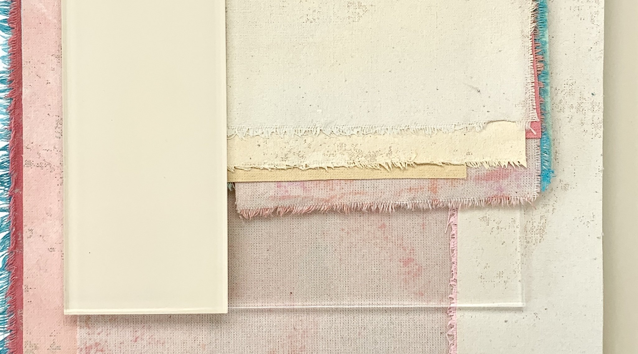
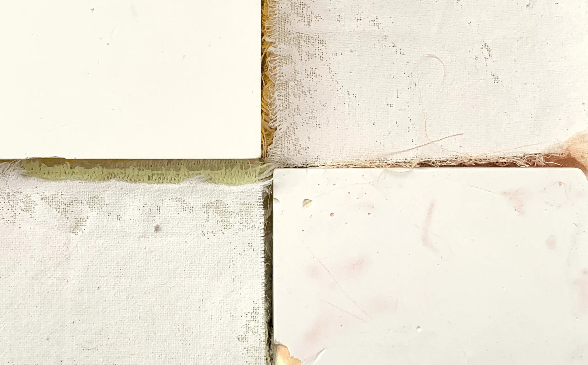
During my recovery, my palette softened. I found myself drawn to quieter environments and more muted tones, places and colours that felt calming and restorative rather than loud and demanding. I spent time in the South of France, where the light and soft Mediterranean colours supported this shift. The experience helped me build a deeper relationship with colour.
I began to listen more closely to my body and my energy levels, allowing them to guide my choices. My colour palette became a response to where I was in my life rather than an experiment with visual impact. Through this, I started to understand that seemingly quiet colours can carry just as much meaning and impact as obviously bold ones.
Intensity without noise
As my work became more minimal, I found myself drawn to artists such as Robert Ryman and Agnes Martin. Their work holds an intensity without noise, a quiet strength that doesn’t rely on big gestures or dramatic colour. This resonated deeply with where I was at the time and with what I wanted my own work to express.
What I was learning was not simply that less is more, but that restraint can be powerful. Softness can be deliberate and quietness can hold depth.
Making work that supports, not demands
This shift in my palette surprised me, but I now see it as something I needed. I had to work with colours that felt supportive of my recovery rather than demanding of my limited energy. I learned how important it is to make work that meets you where you are, even when that means letting go of familiar ways of working.
At first, that letting go felt difficult. Over time, though, it opened up a new creative path, one that felt aligned with rest, care and recovery.
Colour as a response to place
As my energy has slowly returned, I’ve felt another shift emerging. There is an urge to work with a bolder palette again, but now it’s informed by everything I discovered during that quieter period. I’m interested in colour that speaks with a quiet intensity rather than an obvious shout.
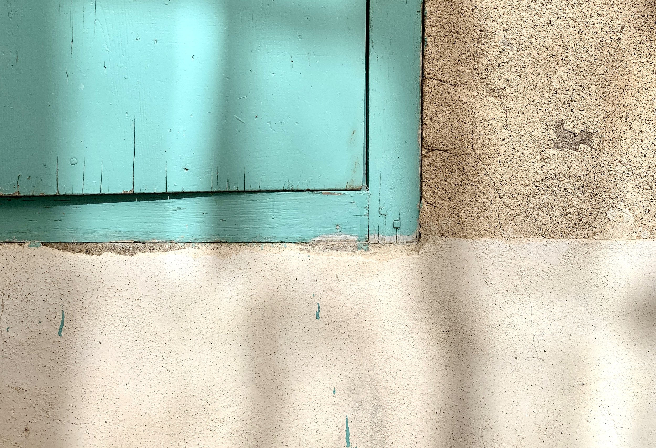
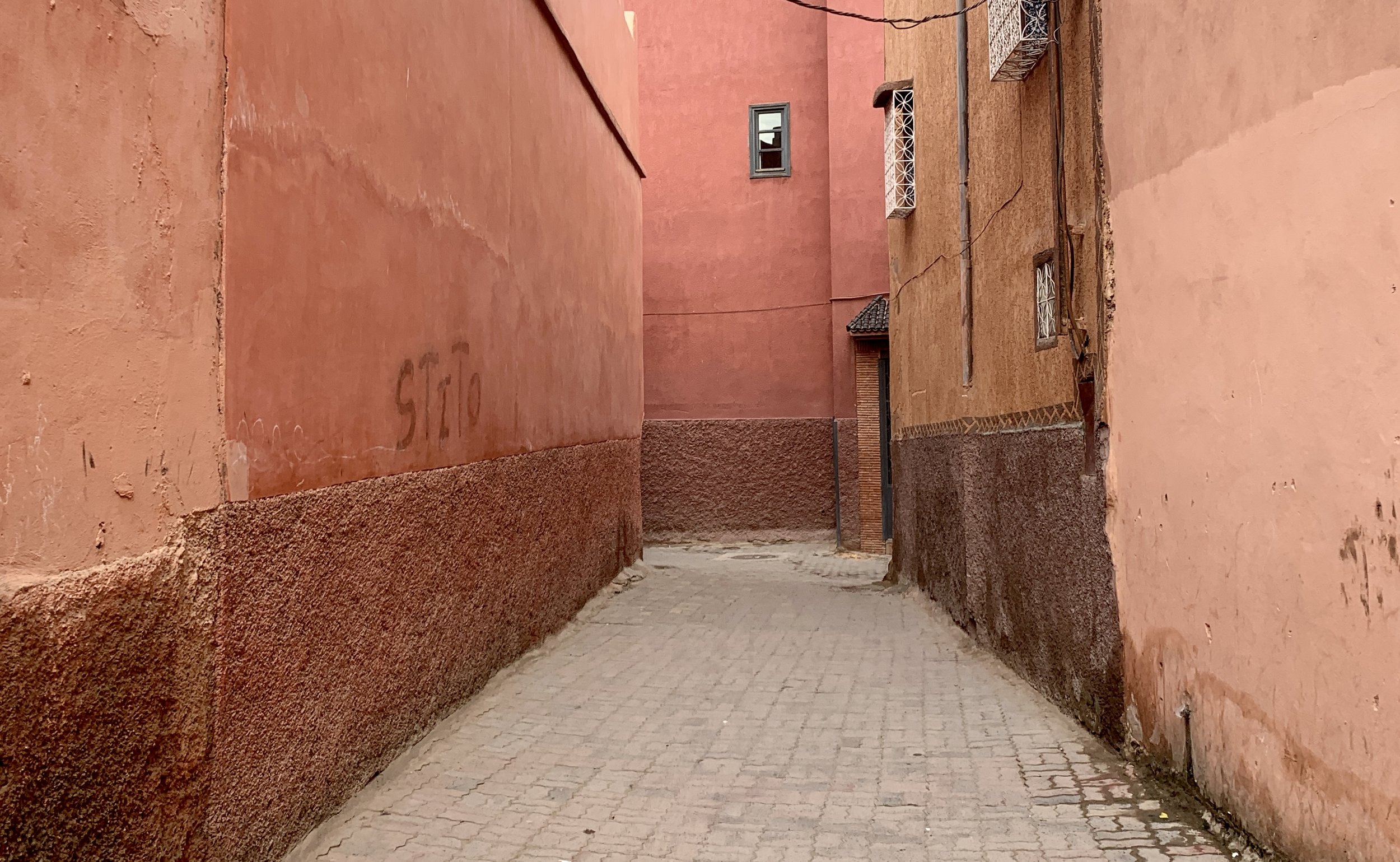
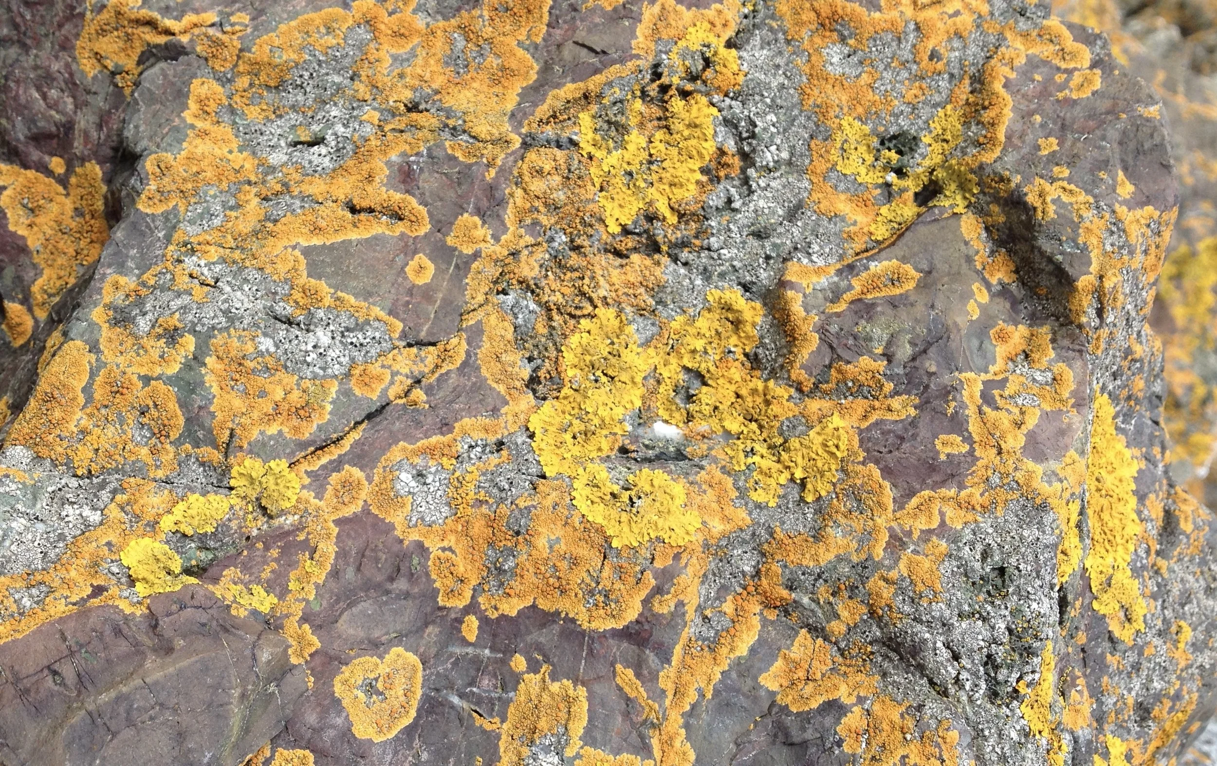
Following my recent trip to Marrakech, I am continuing to explore colour as a response to place. The souks were full of vibrancy: the people, textiles, spices, and brightly coloured slippers, but it wasn’t these that stayed with me most strongly. Instead, it was the soft dusty pinks and peachy oranges of the walls. The warm ochres and earthy tones of red sandstone and clay that give Marrakech its name as the Rose or Ochre City. The flaking layers of pigment and patches of faded paint gently whispered something of the history held within those surfaces.
Colour as an intuitive language
Noticing colour feels second nature to me. I do it without thinking, wherever I am: the purple edge of a leaf on a walk, the neon yellow of a piece of discarded plastic on the pavement. Colour is a language that helps us make sense of the world around us, even when we’re not consciously aware of it.
Through teaching colour, I’ve come to realise that many people don’t feel confident engaging with this language. They often don’t notice colour in their everyday surroundings or trust what they are drawn to. Instead, they look to theory or “rules” about what works, considering colour as something to get right rather than something to respond to.
The fundamental principles of colour are important but we don’t learn about colour only through theory. We also learn it by living with it, by noticing it as we move through the world. As Josef Albers (1968) suggested, studying colour is ultimately a way of understanding ourselves- through experience, perception and attention rather than fixed rules. When we begin to pay attention to the colours around us, in nature or the built environment, we start to build a more intuitive understanding of how colour works and how it affects us. Over time, this attention helps us trust our instincts, rely less on external rules and allow colour to become playful and inspiring.
Noticing colour in this way is also a mindful practice. It gently brings us into the present moment and helps us tune into what feels supportive, grounding or energising, both visually and emotionally.
An invitation
So I invite you to reflect on your own colour language and to let colour be a companion as you move through your day.
Pause for a moment and ask yourself: what colours feel supportive to me right now?
If you’d like to see how this way of listening to colour unfolds in my practice, I share ongoing reflections and work in-progress on Instagram. There’s a link is at the bottom of the page.
Reference
Albers, J. (1968) Oral history interview with Josef Albers, 22 June–5 July 1968, conducted by Sevim Fesci, Archives of American Art, Smithsonian Institution. Available at: https://www.aaa.si.edu/collections/interviews/oral-history-interview-josef-albers-11847